Everything starts with an idea. Leading up to the launch of Phantom Copy, we knew we had that idea: a marketplace where car dealers could buy pre-written content for their website or opt for connecting with a writer to write custom content. We knew the space, we knew the players, and we knew the writers. But to put that idea into action, we needed — among other things — a name, a logo, and a website. I was tasked with the branding part of the equation, starting with the name.
Read More: What is a Content Marketplace?
Why Phantom?
We considered a number of names ranging from automotive-specific names to industry-agnostic names. So we had to ask ourselves: Will we only write for car dealers? Will we write for any business that wants to increase its website traffic and Google search ranking? Or should we start in automotive because of our experience and eventually move towards servicing multiple verticals?
Through our process, one common theme kept popping up: this was essentially a ghostwriters’ marketplace. From there, we considered a plethora of ghastly names, landing on Phantom Copy in part because it contained a subtle nod to our automotive background.
Authoring the Next Steps
Once we were committed to Phantom Copy as a name, our next task was deciding our general aesthetic. We wanted to be bookish yet bright and impactful, and we wanted the viewer to feel the romanticized nature of writing, while still being modern enough to resonate in the 21st century.
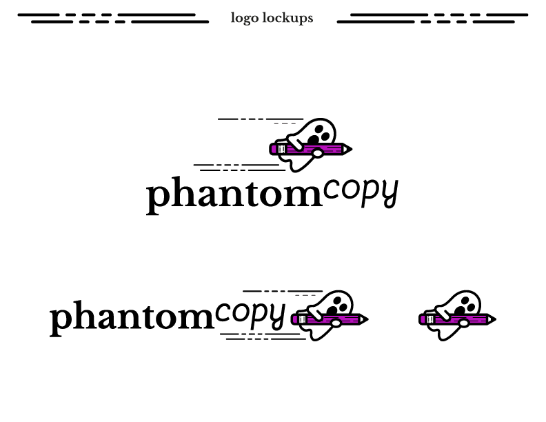
From there, it was easy to see that a mascot-style logo would bridge the various themes, and introduce the brand in a fun way, leading to the creation of the Phantom logo of a ghost holding a pencil. Within the pencil, there is a line quality that mimics the composition of words on a page.
But Where Does the Phantom Live?
A brand is more than just a logo. To further flesh out the theme and create a more immersive universe for the Phantom to reside in, I developed a series of spot illustrations and employed lorem ipsum text as a design element to mimic fog in an equally literary and spooky-cute setting.
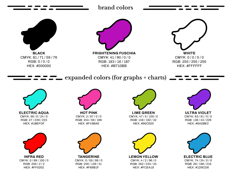
To further the fun of the brand and reduce its possible scariness, we used a copious amount of whitespace and bright, fun colors. This also helped the black keylines used on the illustrative elements to stand out across the site.
Applying the Phantom Brand
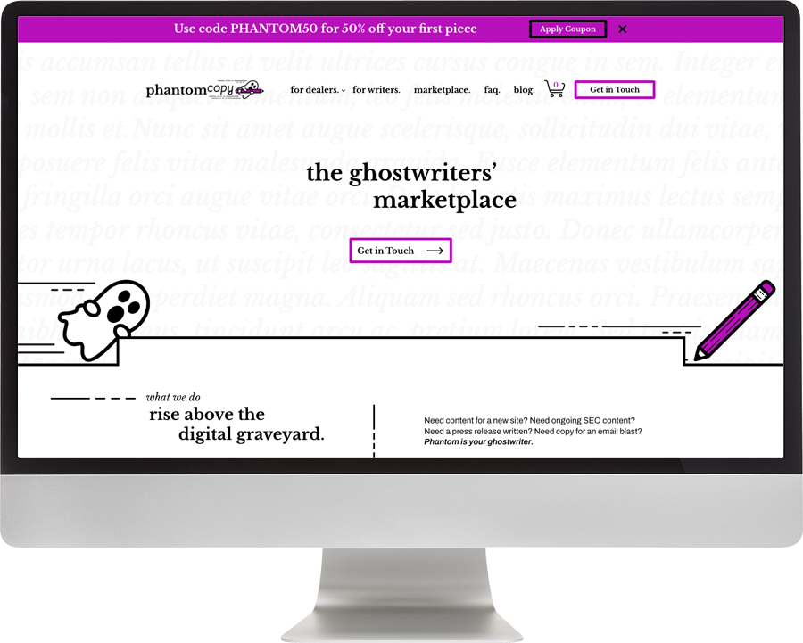
With the name, logo, colors, and general style settled, the next task was applying the brand across our various channels. The first channel was our website, where we used the lorem ipsum text-fog as an element to help differentiate sections on the site, as well as spot illustrations to place the end-user in the Phantom universe.
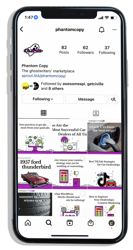
For our social presence, we wanted to mix things up a bit more to keep it interesting. That led us to combine a limited sampling of our expanded colors with our signature fuchsia across our blog articles and image carousels. We also made the conscious choice to introduce photography where it made sense, but with illustrative elements to relate it to the rest of the Phantom universe.
We hope that the spirit of Phantom Copy stays with you, and if you ever need content for your website, we’ll be here.
